Category Archives: Blogs

Recent and past blog posts by Dr. Carey W. King.

Relations Between Energy and Structure of the U.S. Economy Over Time

If you care to understand how the “energy part” of our economy feeds back and shapes the “non-energy part” of the economy, then this blog’s for you!

Essentially every energy analyst and energy economist should understand the results of this paper.

The findings of this paper have important implications for economic modeling in that the paper helps explain how fundamental shifts in resources costs relate to economic structure and economic growth.

This is a summary of a my publication in Biophysical Economics and Resource Quality:

King, Carey W.  Information Theory to Assess Relations Between Energy and Structure of the U.S. Economy Over Time. Biophysical Economics and Resource Quality, 2016, 1 (2), 10. doi: 10.1007/s41247-016-0011-y.  View paper free online here: link, or download a pre-print draft: pdficon_small link.


One of the major driving influences of the research behind this paper comes from a mixture of ideas from Charlie Hall and Joseph Tainter.   Hall (an ecologist by degree)  is seen by many as “Dr. EROI” where EROI = ‘energy return on energy invested’ is the most-common ‘net energy’ term for a calculation for how much energy you get for each unit of energy you use to extract energy.  Tainter (an anthropologist) appreciates the concept of net energy and has applied it qualitatively to describe that more net energy and gross energy is required to enable the structure of ‘complex’ societies (mostly, but not entirely, in a pre-industrial context):

“Energy gain has implications beyond mere accounting. It fundamentally influences the structure and organization of living systems, including human societies.”

(Tainter et al, 2003: article link)

WHY DO WE CARE?    Complexity … redundancy versus efficiency … equality versus hierarchy …

The reason why we care to understand the state of the economy, or other complex systems, in terms of efficiency and redundancy (or resilience) is that more efficient systems (that produce more output for increasingly fewer inputs) are also brittle.  If conditions change, they are less able to adapt.  The same conditions that allowed them to greatly increase output with fewer inputs also force them to greatly decrease output when those fewer inputs are no longer available (e.g., oil imports are embargoed).


In this paper, I put Tainter and other ideas relating to tradeoffs of “efficiency” and “redundancy” to the test.  I did so using the concepts of ecologist Robert Ulanowicz, who has for a large part of his career worked on calculating the ‘structure’ of ecosystems using an information theory approach.  I was immediately convinced that Ulanowicz’s framework could be applied to economic data to test Tainter’s concept and also test if there indeed was any relationship we could see between net energy and the economy.

Thus, my paper describes the changing structure of the United States’ (U.S.) domestic economy by applying Ulanowicz’s information theory-based metrics (with some added twists I felt necessary to be more precise) to the U.S. input-output (I-O) tables (e.g., economic transactions) from 1947 to 2012. The findings of this paper have important implications for economic modeling in that the paper helps explain how fundamental shifts in resources costs relate to economic structure and economic growth.

The results of this paper (summarized in Figure 1) show that increasing gross power consumption, as well as a less spending by food and energy sectors, correlate to increased distribution of money among economic sectors, and vice versa.

In short, the ideas of Hall and Tainter appear to be true: the U.S. economic structure does change significantly depending upon (1) the rate at which we consume energy (e.g., power as energy/year) and (2) the relative cost of energy (and food)!!

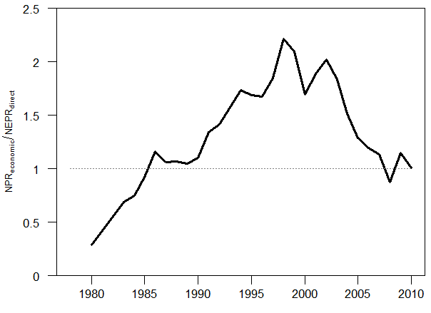
I will now explain in more detail how to understand the results in Figure 1 (see Appendix at the end of this blog to understand how the calculations work).   In Figure 1, the “Net Power Ratio” (NPR) is a metric of “energy and food gain” that is larger when energy and food costs are lower.  Its definition is: NPR = (Gross Domestic Product) / (Expenditures of Energy and Food sectors).


Figure 1. After 2002, when energy, food, and water sector costs increased after reaching their low point, the direction of structural change of the U.S. economy reversed trends indicating that money became increasingly concentrated in fewer types of transactions.


The information theory metrics indicate two time periods at which major structural shifts occurred:  The first was between 1967 and 1972, and the second was around the turn of the 21st Century when food and energy expenditures no longer continued to decrease after 2002.


Structural Shift 1 (1967 or 1972):

The change in trend around 1967 (could possibly be described as 1972) is that equality shifts from increasing to decreasing.

From 1945 until 1967/1972, both equality and redundancy were increasing.  The U.S. was increasing its power consumption (e.g., energy/yr) at about 4%/yr. That is to say, the U.S. economy was booming after World War II gobbling up more and more energy every year at a high rate because energy (e.g., oil) was abundant and getting cheaper by the day.

Increasing equality means that over time each sector of the economy was coming closer to the condition that each sector had approximately the same total sales in a year.  That is to say, the sales of the “construction” sector were becoming more equal to the sales of the “aircraft and parts” and “amusement” sectors.  Some sectors would sell less over time (e.g., “farming”) and some sectors would sell more (e.g., “metals manufacturing”).  This makes sense because some “new” sectors have practically no transactions in 1954 whereas they are more integrated into the economy in 1967 (e.g, “aircraft and parts” and “amusement”).

Increasing redundancy means that over time each sectoral transaction (e.g., “farms” to “metals manufacturing” or “oil and gas” to “machinery and equipment manufacturing”) was becoming more equal.  This again makes sense because some “new” sectors have practically no transactions in 1954 whereas they are more integrated into the economy in 1967.

The structural shift in the U.S. economy can be explained by a few things that came to a head in the late 1960s and early 1970s:

  1. U.S. had little global competition for resources in immediate aftermath of World War II (e.g., Europe and Japan were devastated and needed time to recover).
  2. Oil:  Peak U.S. crude oil production in 1970 enabled the Arab oil embargo of 1973, and OPEC’s increase in posted oil price in 1974, to raise oil prices to such a degree as to cause a significant decrease in global oil consumption.
  3. Efficiency and environmental controls enacted for the first time:   The Clean Air Act (1970) and Clean Water Act (1972) were substantially increased in scope and enforcement.  The environmental and energy changes encouraged significant investment in utilities (e.g., wastewater treatment) and resource extraction along with a focus on consumer energy efficiency for the first time since industrialization.


Structural Shift 2 (2002):

One of the theories of ecologists (e.g., Howard T. Odum and Robert Ulanowicz) is that systems must have some “structural reserves” in existence to be able to respond to resource constraints or other disturbances that might occur in the future.

The major change that occurred in 2002 was that energy and food no longer continued to get cheaper.  If you’ve followed my work, you know this already (see my blog from 2012)!!!  As I’ve stated in even more detail in my papers in 2015 (Part 2 and Part 3 of 3-part series in Energies) this is the defining macro trend of the Industrial Era (no, really …).

In response to this second structural shift from energy and food costs, it is clear that the U.S. economy did trade off structural reserves for efficiency.  Efficiency is the opposite of redundancy in Figure 1, so that the efficiency of the economy decreased all the way to 2002 after which it started increasing efficiency.  The U.S. economy decreased structural redundancy and equality for structural efficiency (e.g., increasing metrics of efficiency and hierarchy) after food and energy expenditures increased post-2002.

So after 2002, the U.S. economy (and by my inference, the same thing is happening in each world economy overall) had to shift money into FEWER sectors and FEWER types of transactions.

  1. China had entered the World Trade Organization in 2001 and started to become the world’s manufacturer.  This decreased monetary flows to domestic manufacturing.
  2. Financial deregulation in the 1990s, including the Gramm–Leach–Bliley Act of 1999 which repealed the Glass-Steagall Act, increased the monetary flows to the financial sectors.
  3. These two effects (China and financial deregulation) led to increased demand and speculation for energy and commodities, so that monetary flows increased to the oil and gas sector (remember the highest oil price of $147/BBL in July of 2008 during the height of the Great Recession) to meet U.S. and global demand.


APPENDIX: How to interpret the results in Figure 1 via the methods of the paper.

  • Consider the U.S. economy as many ‘sectors’ buying and selling products with each other (See Figure 2)
  •       –  Example sectors are “oil and gas sector” and “farming”, etc.


  • Each sector also produces some “net output” (a column “to the right” not shown in FIgure 2)
  •       –  This net output from each sector sums to GDP
  •       –  Also represents largely what you and I buy as consumers

iopicture_20161105

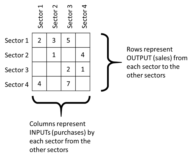
FIgure 2.  The economy’s transactions are often viewed via the “input-output” table where each entry represents how much of a given sector (on the column) purchases from a given sector (on the row).


  • A highly redundant economy (or system or network of flows) interacts with many of the possible partners in many ways and relatively equally (Figure 3 – LEFT).  This might not be the best for growth, but you have “backups” in case things go wrong with one of your partners.
  • A highly efficient economy (or system or network of flows) interacts with fewer possible partners such that there are fewer sectors or people to deal with to get things done (Figure 3 – RIGHT).  This efficiency can, and typically does lead to increased potential for growth.

redundancy_and_efficiency_matrices

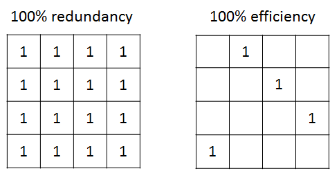
Figure 3.  What the distribution of monetary flows (from one sector to another) looks like for an economy (or generically a network of flows) that is fully, or 100%, redundant (LEFT image) and one that is fully, or 100%, efficient (RIGHT image).  The numbers don’t have to be all “1”, they could be any number that is the same.


  • A highly equal economy (or system or network of flows) interacts with many of the possible partners in equal manners such that every sector or actors sells and buys the same total amount of goods and services (Figure 4 – LEFT).   Note that both the images in Figure 3 are also 100% equal. This is not a practical expectation because we can easily understand structural relationships among economic sectors that will prevent equality (e.g., the “oil and gas extraction” sector sells most of its products to the “refined oil products” sector).
  • A highly hierarchical economy (or system or network of flows) has a small number of sectors that dominate the transactions and monetary flows (Figure 4 – RIGHT).  In the extreme case of FIgure 4 – RIGHT, there is only one type of transaction that occurs (Sector 1 purchasing stuff from Sector 4) and the economy actually no longer is defined the same (e.g., Sectors 2 and 3 don’t effectively exist since they have no transactions).

equality_and_hierarchy_matrices

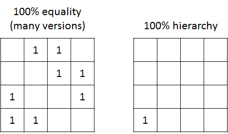
Figure 4.  What the distribution of monetary flows (from one sector to another) looks like for an economy (or generically a network of flows) that is fully, or 100%, equal (LEFT image) and one that is fully, or 100%, hierarchical (RIGHT image).  The numbers don’t have to be all “1”, they could be any number that is the same.


The Most Important and Misleading Assumption in the World

Note: This is the second of a two-part series by the author. Part one: “Macro and climate economics: It’s time to talk about the ‘elephant in the room’.

Part one of this blog post explained how macroeconomic models are flawed in a fundamental way.

These models are coupled to models of the Earth’s natural systems as Integrated Assessment Models (IAMs) that are used to inform climate change policy. Most IAM results presented in the Intergovernmental Panel on Climate Change (IPCC) reports show climate mitigation costs as trivial compared to gains in economic growth.

The referred to “elephant in the room” (from part one of this series) is the fact that economic growth is usually simply assumed to occur.  No matter what the quantity or rate of investment in the energy system or the level of climate damages, the results indicate that economy will always grow. This defies intuition, and begs the question: If the costs of climate mitigation really are so small, then why is there so much disagreement over a low-carbon transition?

One way to explain the problem is via a term called “total factor productivity,” or TFP.  TFP is the Achilles Heel of macroeconomics, and why no one talks about the aforementioned elephant with the exposed heel in the macroeconomics classroom.

Essentially economic output, or GDP, is usually modeled as being dependent upon the amount of labor in the workforce, the amount of capital (e.g., factories, machines, computers, buildings), and TFP.

TFP can be understood as all of the reasons why the economy grows that are not already characterized by the quantity of labor and capital.  In statistical terms it’s called a “residual,” or the amount unexplained by an assumed underlying equation of economic growth.

TFP is often projected to continue (based upon trends from historical rates) at around 1.5 percent annually.  Because labor and capital change relatively slowly (aside from events such as wars, a quick rise in sea level, or other similar “events”), this TFP assumption effectively assumes a large amount of growth into the future.

Further, the assumption of a historical annual rate of increase in TFP is inherently independent of energy-related factors (see IPCC report “Climate Change 2014: Mitigation of Climate Change”). Thus, the normal IAM assumption is inadequate because it presents the case to policy makers that even dramatic increases in energy investment for a low-carbon energy transition don’t affect TFP and hence economic growth.

This is a problem since it makes the transition appear trivial. It’s incorrect, however, to assume TFP will continue into the future just as it had in the past because the past was a time of increasing carbonization of the economy.  It is too much of an extrapolation to assume TFP will be the same during decarbonization.

But there is a solution.

A significant body of research indicates that accounting for both energy and its conversion efficiency to physical work (e.g., engines and motors) and other energy services (e.g., light) can explain the vast majority of TFP. That is to say, instead of assuming an increase in TFP into the future that is independent of the modeled energy technology investments, we could assume a series of low-carbon energy technology investments and estimate the effect on TFP, thus economic growth, from the bottom up.

TFP is effectively composed of the effects of machines and energy substituting for human labor. A human pushing a button on an electrified machine is more “productive” than that human turning a crank by hand on that same machine.

Part of the reason why TFP, and its cousin labor productivity (= economic output / hour of labor), have been decreasing in the last decade is due to declining energy consumption and slower improvements in efficiency.  There are still a lot of low-hanging fruit, however, we already picked the ripe fruit that fell to the ground.  And, it still takes effort to pick even the low-hanging fruit. There is no free (fruit) lunch.

Aside from a need to develop more accurate macroeconomic models that explicitly account for the role of energy, there is a larger concern in regard to sustainability. The modeling improvements discussed in this post relate to the economic and environmental (e.g., climate, energy) pillars of sustainability.

Existing models, however, also inhibit discussion of equity, the third pillar. If we convince ourselves that we will always grow in the future, no matter what, then we can more easily convince ourselves that we can defer the question of sharing until the future, until after we’ve figured out growth for now.

This is exactly why the exogenous TFP assumption is socially dangerous.

The models simply assume economic growth occurs.  Then, since everyone is convinced that the world is going to have more wealth to share in the future, no matter what, then we can avoid discussions about sharing and preserving what we have now.  We can deflect the conversation to “growth” instead of the “equitable” part of sustainability.  “Help us grow the economy first, and then we can fix the other issues.”

That said, we know a number of things for certain.

The Earth is finite, and we know we cannot have infinite growth on a finite planet.   Thus we need physical and economic models that also reflect this reality. Unfortunately, we’re using economic models that ignore this reality. Why should we make policy using economic models that don’t reflect what should be obvious to a third-grader?

We can do better, and we must do better if we want realistic economic assessments of a low-carbon energy transition. If we don’t want realistic assessments, then we can continue the status quo, which is to explain the future economy by projecting a factor (i.e., TFP) defined as what cannot explained by insufficient theory.

Macro and Climate Economics: It’s Time to Talk about the “Elephant in the Room”

This blog was written for the Cynthia and George Mitchell Foundation, and originally appeared here: http://www.cgmf.org/blog-entry/213/.

This is the first of a two-part series. Part 2 is: “The most important and misleading assumption in the world.

If we want to maximize our ability to achieve future energy, climate, and economic goals, we must start to use improved economic modeling concepts.  There is a very real tradeoff of the rate at which we address climate change and the amount of economic growth we experience during the transition to a low-carbon economy.

If we ignore this tradeoff, as do most of the economic models, then we risk politicians and citizens revolting against the energy transition midway through.

On September 3, 2016, President Obama and Chinese President Xi Jinping each joined the Paris Climate Change Agreement to support U.S. and Chinese efforts to greenhouse gas emissions (GHGs) limits for their respective country. This is an important signal to the world that the presidents of the two largest economies and GHG emitters are cooperating on a truly global environmental matter, and it provides two leaps toward obtaining enough global commitments to set the Paris Agreement in motion.

The economic outcomes from models used to inform policymakers like Presidents Obama and Xi, however, are so fundamentally flawed that they are delusional.

The projections for climate and economy interactions during a transition to low-carbon economy are performed using Integrated Assessment Models (IAMs) that link earth systems models to human activities via economic models. Several of these IAMs inform the Intergovernmental Panel on Climate Change (IPCC), and the IPCC reports in turn inform policy makers.

The earth systems part of the IAMs project changes to climate from increased concentration of greenhouse gases in the atmosphere, land use changes, and other biophysical factors.  The economic part of the IAMs characterizes human responses to the climate and the changes in energy technologies that are needed to limit global GHG emissions.

For example, the latest IPCC report, the Fifth Assessment Report (AR5), projects a range of baseline (e.g., no GHG mitigation) scenarios in which the world economy is between 300 and and 800 percent larger in the year 2100 as compared to 2010.

The AR5 report goes on to indicate the modeled decline in economic growth under various levels of GHG mitigation. That is to say, the economic modeling assumes there are additional investments, beyond business as usual, needed to reduce GHG emissions.  Because these investments are in addition to those made in the baseline scenario, they cost more money and the economy will grow less.

The report indicates that if countries invest enough to reduce GHG emissions over time to stay below a policy target of a 2oC temperature increase by 2100 (e.g., CO2, eq. concentrations < 450 ppm), then the decline in the size of the economy is typically less than 5 percent, or possibly up to 11 percent.  This economic result coincides with a GHG emissions trajectory that essentially reaches zero net GHG emissions worldwide by 2100.

Think about that result: Zero net emissions by 2100 and, instead of the economy being 300 to 800 percent larger without mitigation, it is “only” 280 to 750 percent larger with full mitigation.  Apparently we’ll be much richer in the future no matter if we mitigate GHG emissions or not, and there is no reported possibility of a smaller economy.

This type of result is delusional, and doesn’t pass the smell test.

Humans have not lived with zero net annual GHG emissions since before the start of agriculture.  The results from the models also indicate the economy always grows no matter the level of climate mitigation or economic damages from increased temperatures.

The reason that models appear to output that economic growth always occurs is because they actually input that growth always occurs.  Economic growth is an assumption put into the models.

This assumption in macroeconomic models is the so-called elephant in the room that, unfortunately, almost no one talks about or seeks to improve. 

The models do answer one (not very useful) question: “If the economy grows this much, what types of energy investments can I make?”  Instead, the models should answer a much more relevant question: “If I make these energy investments, what happens to the economy?”

The energy economic models, including those used by United States government agencies, effectively assume the economy always returns to some “trend” of the past several decades—the trend of growth, the trend of employment, the trend of technological innovation.  They extrapolate the past economy into a future low-carbon economy in a way that is guesswork at best, and a belief system at worst.

We have experience in witnessing disasters of extrapolation.

The space shuttle Challenger exploded because the launch was pressured to occur during cold temperatures that were outside of the tested range of the sealing O-rings of the solid rocket boosters.  The conditions for launch were outside of the test statistics for the O-rings.

The firm Long Term Capital Management (LTCM), run by Nobel Prize economists, declared bankruptcy due to economic conditions that were thought to be practically impossible to occur.  The conditions of the economy ventured outside of the test statistics of the LTCM models.

The Great Recession surprised former Federal Reserve chairman Alan Greenspan, known as “the Wizard.”  He later testified to Congress that there was a “flaw in the model that I perceived is the critical functioning structure that defines how the world works, so to speak.”

Greenspan extrapolated nearly thirty years of economic growth and debt accumulation as being indefinitely possible. The conditions of the economy ventured outside of the statistics with which Greenspan was familiar.

The state of our world and economy today continues to reside outside of historical statistical realm. Quite simply, we need macroeconomic approaches that can think beyond historical data and statistics.

How do we fix the flaw in macroeconomic models used for assessment of climate change?  Part two of this two-part series will explain that there is research pointing to methods for improved modeling of what is termed “total factor productivity,” and, in effect, economic growth as a function of the energy system many seek to transform.

Keep Austin Weird by Making Austin Wealthy … all of it

(This post was an opinion editorial in the Austin American Statesman, September, 2, 2016: Keep Austin Weird by Making Austin Wealthy … all of it.)

Keep Austin Weird. The mantra is everywhere – on shirts, coffee mugs, and bumper stickers.

And yet Austin seems to be losing its weirdness.

Downtown music venues are struggling.  Leslie, the scantily clad, homeless, former mayoral candidate, has passed. Perhaps the clearest sign of losing our weirdness is that Austin hosts a Formula 1 race – a combination of glamour and technology that leaves no trace of “weird” in its tracks.  But such are the challenges of a growing city.

Some weirdness remains. Just take a look at the early mornings at Barton Springs pool. Austin is the largest city that doesn’t host a major league sports team. And we still have vibrant movie rental stores.

But I think we need a new mantra: Make Austin Wealthy – and by “wealthy,” I mean emphasizing all kinds of assets, and by “Austin” I mean every person and neighborhood in Austin.

Most of the time when we think about wealth we think of money, or financial capital. We also usually consider how many assets we own either individually (home, car, etc.) or collectively (buildings, roads, water and energy system, etc.) This is built or physical capital.

But there are other forms of capital that we need to consider to ensure a vibrant community, economy or city.

Natural capital is the water, land, trees, animals, clean air and other natural resources that surround us. Political capital is access to structures of power and the ability to influence rules that shape the distribution of resources, such as the district-based representation on the Austin City Council. There is human capital:  Austin has this in spades – the sum total of knowledge and skills acquired through educational channels. And we have cultural capital: cultural understandings and practices that shape how we grasp the world.  Keep Austin Weird was about buying local to maintain local character.

The increasing social tensions in various cities across the United States is the reason why these ideas are important. These tensions are sometimes manifestations of racial injustice, voter redistricting, or income stagnation and inequality, among other drivers.  No one wants increased social tension in Austin, but Austin is not immune. At least one study shows that the Austin metro area is among the most economically segregated in the country.

We should ensure that the rising tide of Austin’s prosperity lifts all canoes on Lake Austin, not only yachts on Lake Travis.  But there are global pressures as well.

Since the beginning of the Industrial Revolution, the cost of the core goods of energy and food were getting cheaper until around the year 2000. After 2000, they have become slightly more expensive.  For 200 years, human ingenuity, beginning with the advent of the steam engine for producing coal, had continually enabled us to prosper while making our core needs more affordable.  But since 2000, no longer.

This and other feedbacks from our finite Earth are applying pressure to separate local communities, between those adapted to a globalized world and those that are disconnected.  We hear this in the speeches of both Donald Trump and Hillary Clinton. They both claim to be against new free trade treaties. However, Pandora’s Box has been opened, we can’t put globalization back into it without some ramifications.

We usually focus on increasing wealth, and we still can and should.  But what we can more directly choose is how to share all various forms of wealth that we have, no matter how much there is.

The past century was about unrestricted growth in a resource-abundant world.  This next century is about reorganizing an increasingly unequal society in an increasingly resource-scarce world to enhance cooperation. Austin’s smart. Austin’s still a little weird. Perhaps the weirdest thing we could do is to become the best city in the world at spreading the wealth. Let’s increase the distribution of capital within our capital city. Keep Austin Weird by Making Austin Wealthy – all of it.

Carey W. King is Research Scientist and Assistant Director of the Energy Institute at The University of Texas at Austin.

The Most Interesting Chart I’ve ever Made: Energy versus Money Leverage

Figure 1 is perhaps the most interesting chart I have ever made. The purpose of this figure (from my publication here) is to provide context into metrics of net energy and see how they relate to economic data. Here, I’m asking a fundamental question: should our (worldwide) society be able to leverage money more than we can leverage energy? My hypothesis is “no” and would be represented by values < 1 in Figure 1. Clearly the plotted ratio of ratios in Figure 1 is not less than one (for all years) per my hypothesis, so why might this be the case?  As I discuss below, understanding the data in Figure 1 is crucial for making better macroeconomic models of the economy that properly account for the role of energy.

NPR_compare_NEPRdirect_World44Only_White

Figure 1.  This is a ratio of how much the worldwide economy leverages money spent by the energy sector relative to how much surplus energy is produced by the energy sector itself.  Specifically this calculation (using world numbers) = (GDP/money spending on energy by the energy system) / [ (world primary energy production – energy spending by the energy system) / energy spending by the energy system)].

I created Figure 1 by dividing the data from Figure 3 by the data from Figure 2.  Figure 2 is a calculation of the leverage of energy, and Figure 3 is a calculation of the leverage of money. I now describe each of Figure 2 and 3.

For a full description of the underlying data and calculations, see Part 2 (and Part 1) of my papers in Energies in 2015.

Net Energy

Net energy provides an additional lens, besides money, to understand how our economy works.  Net energy is the amount of energy that is left over for consumption after we subtract the energy inputs that are required to produce that energy.  The energy production and consumption quantities you see in statistical databases (such as those housed by the Energy Information Administration (EIA), BP, and International Energy Agency (IEA)) is gross energy, often referred to as total primary energy supply (TPES) consumed per year.  For example, the world TPES is approximately 550 EJ as reported by the EIA.

Figure 2 shows the data used in the denominator of the calculation of Figure 1.  The solid red line indicates the average value for the world. The underlying data come from the IEA. This figure indicates that since around 1995, for every unit of energy consumed by the energy industry, the energy industry provides about 14-15 units of energy for all consumers and other industries.  Before 1985, this “energy return on energy invested” was greater than 20 (data are not available to for a viable estimate before 1980).  In the case of this figure, there are no other types of inputs considered besides energy itself.  No wages. No materials. No computers or consultants. Nothing but energy.

NEPRDirect_EachCountry

Figure 2.  This is a ratio of how much net energy the worldwide energy system produces for all other sectors and consumers after it consumes the energy it needs for its own operation.   The solid red line represents the world average.  The dashed red line represents the average for OECD countries only. Each gray line represents the data for one country (the countries with high values are countries that are net energy exporters). Specifically this calculation (using world numbers) = [ (world primary energy production – energy spending by the energy system) / energy spending by the energy system)].

Money Leverage

Figure 3 is about money, not energy.  Consider adding up all energy spending (in money) by the worldwide energy industry and dividing that by the GDP of the world. A typical quantity is 0.04-0.07, or 4-7%.  Essentially this is an input (spending by energy sector) divided by an output (GDP).  In order to compare these monetary data to the net energy data of Figure 2, I need to phrase them in an equivalent manner.  Figure 2 shows energy outputs divided by energy inputs.  Thus, by inverting the monetary energy spending ratio, I turn it from a ratio of input/output to a ratio of output/input.  Thus, if world energy sector spending was equivalent to 5% (or 0.05), 1 divided by this number is 20. Thus, we can say that the economic output of the economy is 20 times larger than the monetary spending of the energy sectors.  Figure 3 plots this ratio for the world.

NPReconomic_World_white_png

Figure 3.  This is a ratio of how much the worldwide economy leverages money spent by the energy sector.  Specifically this calculation (using world numbers) = (world GDP / money spending on energy by the energy system).

Why this is interesting

Fundamentally the ratios of Figures 2 and 3 are about measuring inputs of “something” to the energy industry in comparison to outputs of that “something” consumed or created by the rest of the economy.  In Figure 2 the “something” is energy, and in Figure 3 that “something” is money.  Figure 1 shows the data of Figure 3 divided by the data of Figure 2.

Should the output:input (“leverage” or “return on investment, ROI”) of energy (often termed EROI) be greater than or less than the output:input (“leverage” or “return on investment”) of money?  My hypothesis is that the energy ratio should be larger than the monetary ratio.  Thus, the measure in Figure 1 should less than 1.

The reasoning is as follows.  The energy inputs used in Figure 2 only include energy consumed by the energy industry.  As I wrote before, no other inputs such as wages, materials, offices, or administration are considered.  By considering any number of these other inputs (and converting to units of energy), the energy return on investment ratio can only decrease.  However, the assumption behind the monetary ratio of Figure 3 is that all types of inputs have been included in units of money.  That is to say, the energy sector purchases inputs as energy, machines, and various services from itself and other economic sectors.  Thus, there are many more inputs (theoretically all required monetary investments) considered in the monetary output:input ratio for the energy sector and economy.

So back to my hypothesis that the ratio plotted in Figure 1 should be less than 1.  How can we explain values > 1?  The general (but not satisfying) answer is that GDP (gross domestic product) is a measure of economic throughput that is not backed by anything purely physical, but by what we (as consumers) perceive as valuable.  Thus, we can value a service or product at one level in one year, but change our mind as to the value in another year.  Much value is also currently placed in information-related companies (Facebook, IBM’s Watson, etc.), and there is ongoing debate as to whether the value of this information (e.g., in social network companies) is overvalued.  Is social networking overvalued, as a business, and will these valuations decline if people can’t actually afford to buy new products suggested by the ads targeting them?  I suppose we don’t know the answer, and we’ll eventually find out.

Debt as an Explanation

But I think debt accumulation is likely the best explanation for why the economy seems to be able to leverage money more than energy spending by the energy sector.  To some degree, increases in debt in the 10-20 years leading up to 2008 (when the ratio in Figure 1 reached a value of 1) were responsible for increasing the quantity GDP.   Government and consumer spending beyond their means shows up as increases in GDP.

Also, if we consider increased debt a expectation of increased future consumption, and consumption (and production) require energy, then increases in debt are an expectation for increases in energy consumption.  And don’t get confused here with discussions of “decoupling” energy from economic activity.  There is yet no evidence that worldwide economic growth occurs without increasing total worldwide energy consumption.  Possible evidence for this debt explanation is the fact that debt accumulation stopped in 2007/2007 (with the financial crisis and peak in commodity prices) when the ratio in Figure 1 was no longer greater than 1.  If I were to have the data through 2015, my guess is that the number would have stayed near 1 through 2013/2014 before again increasing in 2014/2015 as oil prices were falling dramatically (assuming the energy return ratio of Figure 2 remained relatively steady).

I also anticipate (could be confirmed by further research) that the ratio of Figure 1 would be < 1 for all years before 1980 leading to the beginning of the Industrial Revolution. Largely speaking, we extract the easiest to reach resources first, and these resources have high net energy (= low cost).  Thus, resources with higher net energy translate to larger values for Figure 2 which is the denominator for Figure 1. Thus, smaller values of Figure 1. Further, I know from my previous research that spending on energy was never lower than around the year 2000 (see my papers here and here for detailed explanations), which is what is indicated in Figure 3 (e.g., the higher the value the cheaper was energy). Energy continually became less expensive since the beginning of the Industrial Revolution until the 1970s and then again (much slower) through the end of the 20th Century.  Thus, the values for Figure 3 (the numerator of the calculation in Figure 1) will always be larger for the previous 100+ years.

This concept of Figure 1 is so interesting because it is likely that the time period of 1985-2007 is unique in all of history as the time period when the economy leveraged monetary spending by the energy system more than the leverage in energy that was provided by the energy system.  This is a ripe area for further understanding of macroeconomic modeling that properly accounts for the role of energy.

How much can the next president influence the U.S. energy system?

There have been dramatic changes in the U.S. energy system under our current president – a big drop in the use of coal, a boom in domestic oil and gas development from fracking, and the rapid spread of renewable energy.

But in terms of influencing energy technology deployment, the next president will have a lot less influence than you might expect.

When it comes to educating U.S. citizens on energy’s relationship to the broader economy, though, the next president could have a great impact. But I’m not holding my breath. In fact, I’d say it’s likely not going to happen.

Here I pose a few relevant questions about energy and the economy that could be asked of our next president and suggest some answers.

Read the rest of the post at The Conversation …

The stay on the Clean Power Plan: A mountain out of a molehill

Much of the hyperbole over the Supreme Court’s stay of the EPA’s Clean Power Plan (CPP) is making a mountain out of a molehill. The CPP is very significant politically, legally, but its CO2 goals are trivial in the grand scheme of sustainable consumption patterns, technological capability, stated goals (not commitments) at Conference of Parties global climate talks.  The CPP targets are a piece of cake. And I say this as someone that is not a techno-optimist in the sense that technology alone will not solve all socioeconomic problems.

Contemporary discussions of energy resources and technologies are full of conflicting news, views, and opinions from extreme sides of arguments.  The discussions regarding the recent Supreme Court decision to stay the Clean Power Plan (CPP) fall right in line with this narrative.  While the recent 5-4 Supreme Court ruling centers on the legality of the CPP, the responses in the corporate and public arena largely focus on social and economic arguments. This is a good thing. Deciding on broad social goals should not hinge on legal technicalities because our social perspectives should shape and rewrite laws as needed. When the law is just plain morally wrong, we need to change it. We’ve done this several times via Constitutional Amendments when we abolished slavery and gave women the right to vote.

The hyperbolic discussion regarding the Supreme Court decision is an example of how trivial environmental and technology changes translate to gargantuan policy and legal arguments.  I briefly discuss arguments by the “right” and “left” and point out important aspects that caveat those arguments.

The anti low-carbon “right” (stereotypically conservatives, Republicans, and many pro-business groups such as the U.S. Chamber of Commerce) claim that taking proactive measures to reduce greenhouse gas (GHG) emissions will hurt jobs and the poor, kill the economy, and not be as effective as “the market” in reducing emissions but without extra prodding.  There is some truth in these statements. Internalizing GHG into energy costs will make fossil energy more expensive (e.g., does not make low-carbon energy cheaper), and expensive energy (mostly due to oil) has been associated with past recessions.

The pro low-carbon “left” (stereotypically liberals, Democrats, and environmental organizations) point out how renewable (low-carbon) electricity is now cost-competitive with coal and natural gas generation and that some countries, states, and regions already have functioning carbon policies and/or markets without economic downturn, much less ruin. Thus, the claim is that we have the technologies we need, and we can grow the economy while we transition to near 100% renewable and low-carbon energy.  There is some truth in these statements.  Today, utilities and cooperatives can obtain a contract for wind and solar power dirt cheap. Europe, California, New England, and British Columbia have carbon markets or taxes that have not destroyed their economies.

However, both sides of the low-carbon argument neglect important points that prevent us from having a holistic discussion.

The “right” avoids discussing that current market structures have caused the same feared effects they fear from GHG mitigation, such as loss of high-paying jobs for low/mid-skilled workers.  They also usually avoid the obvious point that markets are defined by people to achieve social goals, not the other way around. If the right argued for allocating half of the anticipated low-carbon investments to shore pensions and enhance education of displaced workers, then I could at least listen without cringing.

The “left” avoids mentioning the absurdity of economic assumptions in models that estimate long-term climate change costs and economic growth.  For example, the 2100 economic outcomes in the (latest) Fifth Assessment Report from the Intergovernmental Panel on Climate Change indicate that even if the world shifts to zero net GHG emissions or not, we’ll be somewhere between 3-8 multiples richer than we are today.  If there is no climate change mitigation, we’ll still be pretty much within the same multiples richer than we are today. Really? Human activity can emit from zero to over twice as much net CO2 per year in 2100, and we can’t tell the difference in the economic outcome within the noise of the models? This doesn’t pass my smell test, and the assumptions for increased technological change are not even dependent upon the descriptions of a low-carbon energy system that is being modeled.  See my recent Energies paper (Section 4.2 specifically) that describes how we need much better efforts in macroeconomic modeling of a transition to a low-carbon economy.  We know that economies depend upon energy and technology as an input, it’s time all macroeconomic models include energy as an input.

To be fair, creating markets and trade agreements to effectively and fairly guide global commerce is a large and evolving problem.  Also, modeling future outcomes (for almost anything, much less the economy) 80 years out is difficult to impossible.

But the Clean Power Plan is about electricity generation, in the United States, in 15 years.  Part of the economy. Part of the world. Not too far out.  The tools exist to address the minor targets of the CPP.

Sure we can expect some owners of electricity assets to lose money as those assets become economic and/or are retired before they earn a positive return on investment.  Maybe they are already whole, but will just lose profits they expected. That’s what happens when you change the energy system by law or by market (see this recent article in Bloomberg discussing Nevada’s NV Energy rate hike in response to distributed solar: Who Owns the Sun?).  But again, the targets of the Clean Power Plan are so small relative to our technology capability, and economic growth is so uncertain, if we meet the CPP targets it will probably not even be clear whether or not the CPP was even partially responsible.

This discussion reminds me of the parable of the God-fearing man that died during a flood. He had a vision for how God would save him and had faith that God would do so.  This vision caused the man to refuse help to ride away in a truck before the waters rose, in a boat when water came into his house, and in a helicopter when he was forced to flee to his roof.  After dying from the flood and going to Heaven, the man asked God why He did not save him. God replied “I tried. I sent you a truck, a boat, and a helicopter.”

Usually the right believes that the almighty Market alone will enable us to solve our environmental problems, including a reduction in CO2 emissions from power generation. Well, the Market (with help from intelligent human designers: policymakers, engineers, and scientists) hath provided photovoltaic panels, wind turbines, nuclear power, batteries, conservation technologies, and yes, even hydraulic fracturing to produce more natural gas.

What should Texas do About Integrated Water-Energy Policy Decisions?

This blog was originally posted by the Cynthia and George Mitchell Foundation.

When considering linkages and tradeoffs of water and energy objectives, the usual discussion among colleagues, industry, and government agencies is that we should search for holistic “win-win” situations—a simultaneous beneficial outcome for both energy and water goals.

That is, we should first invest in new technologies and enact new policies that promote use of energy and water resources that are low-cost, clean, and good for the environment.

But “win-win” situations are not always possible, especially when there are myriad of objectives emerging about this subject coupled with water becoming fully allocated in some basins. In fact, by definition, it is impossible to produce a single optimal outcome from multiple objectives.

This opinion piece is meant to provide context of the ongoing dispute—with focus on the Brazos River basin—that concerns surface water rights, farmers (Texas Farm Bureau), electric power, and the Texas Commission on Environmental Quality (TCEQ).

Brazos River and Electric Power Generation

The Brazos River basin in Texas presents an interesting, ongoing case study regarding the allocation of water and the right of the State of Texas, via the TCEQ, to have discretion in interpreting state surface water law.

From late 2010 through most of 2011, Texas received the lowest 12-month rainfall on instrument record. Further, that year was also the hottest on record with many parts of the state experiencing a record number of 100F+ days.

Eventually, water flows in some rivers became low enough that there was not enough flow for all water users to receive their legally allocated surface water.  In the case of drought, senior water rights holders can ask TCEQ to “call” younger water rights, effectively cutting off junior water rights holders from withdrawing water.

In the case of the Brazos River basin in 2011, one senior water right holder at the end of the Brazos River (the Dow Chemical facility located in Freeport, Texas) asked TCEQ to call other water rights, effectively cutting off junior water rights holders from withdrawing water.

As the TCEQ went down the prioritized list it eventually came to some cities and thermoelectric power plants. These power plants are designed to consume and withdraw water for cooling their operations (note: only two thermal power plants in Texas use air cooling). TCEQ did not want to alienate elected officials and their constituents by cutting off water access to power plants (and cities) thus reducing the electricity supply that would, in turn, increase electricity pricing during peak months.

So, the TCEQ didn’t, and cited public health, safety and welfare concerns for its decision.

The only other type of water rights to call? If you guessed farmers, you win the prize.

Heck, farmers have both a large quantity of water rights and demand (over 50% of Texas water consumption is for irrigation), and they represent a low fraction of voters relative to the number of people that want, say, air conditioning.

Legally this practice is allowed in an emergency, but the Texas Farm Bureau has sued TCEQ claiming its new doctrine cannot replace the prior appropriation doctrine for long-term governance.

Over the past couple of years, the Farm Bureau has won an initial legal ruling along with two appeals. At the moment, the TCEQ is appealing, again—this time to the Texas Supreme Court.

Let’s consider the Brazos river situation from a social rather than legal lens.

TCEQ claims that in order to be “healthy” and “safe,” we can’t cut off water supply to thermal power generators. How much water and electricity do we need to be healthy and safe?

First, consider water.

According to the United Nations every human should have access to at least 50 liters/day of water that is safe (clean for washing, cooking, and drinking), affordable (< 3% of household income), and accessible (< 1 km and < 30 minutes away from home).

In the Texas State Water Plan, TWDB estimates that 2010 municipal water demand in Texas was approximately 650 liters/person/day. One important safety issue is the maintenance of proper pressure in municipal water supplies for fighting fires.  However, even including this critical requirement, Texans can be safe and healthy at 25% of normal municipal water consumption.

Some cities have conserved about as much as they can, and have moved to full municipal water recycling (e.g., toilet to tap). Since 2012, there is also talk in Texas of brackish (and seawater) desalination.  I, however, do not want to pay for a desalination facility as long as people are still watering their lawns.

Desalination is financially viable only if the facility is operated full-time at or near capacity.  Given facility capital costs and labor-related expenses, desalination, as a solution for drought, would be cost-prohibitive for most municipalities.  If Texans conserved via 100 percent xeriscaping, and demand for reliable municipal water continued to increase, then I’d consider voting for desalination (as well as considering moving to a wetter location).

Now consider how much electricity a person needs to be healthy and safe.  A minimal amount of electricity (< 2% of Texas’ total of over 430 terawatt-hours per year) is required to run water and wastewater services.  Hospitals, police stations, traffic lights, and other city services also require electricity.  Texas’ 2014 retail sales of electricity were 379 TWh: 37% residential, 36% commercial, and 26% industrial.

Would it be unsafe or unhealthy to consume less commercial or industrial electricity during a drought if it were required due to water right priority?  Certainly that action would not be the most economical option (e.g., curbing industrial production or commercial activity)—but the Texas Farm Bureau isn’t suing the TCEQ over an argument related to economics.

The economic argument is obvious but fallacious to use for an ultimate conclusion.  Consider the following simple back-of-the-envelope example:

Let’s compare dollars of revenue for every acre-foot of water consumption for Texas agriculture, wholesale electric power, and industrial production from the Freeport Dow Chemical facility. These are approximately 2,000, 30,000, and 130,000 $/ac-ft., respectively.  A moredetailed analysis found that if you charge power plants for water consumption, then the cost of water consumption savings for electric power in Texas would be higher than each option in the State Water Plan.

If our water issues were only contingent upon the most economical use of water, we’d not irrigate crops, right? However, we don’t eat petrochemicals or electricity.  Thus economic analyses only take us so far in understanding how we should allocate water amongst competing demands including agriculture.

Practical solutions

So, what should Texas do?

First, the good news: progress has been made on some fronts. The state water planning process was established to continue discussions, although it needs more input in terms of prioritization of options.  Senate Bill 3 (2007) established the process that has now set environmental flow standards for most of Texas’s major rivers, helping allocate water to nature. These flow standards can be updated over time and as new information becomes available.

But there is still a regulatory need to link surface and groundwater legally. Even baby steps would be useful since Hydrology 101 tells us that a single water molecule can start as rain, flow on the ground, and penetrate into groundwater before later coming back to the surface.

Water following this pathway is called a spring, and springs are the reason why people settled along the Hill Country and associated outcrops to begin with.

Investments that recharge groundwater resources when Texas experiences high rainfall events are a good start.  We must help replenish groundwater during wet times since we turn to groundwater during dry times.  Aquifer storage and recovery projects also become more feasible because of the rise in Texas’s population. Plus, we’ve built about as many reservoirs as make sense (note: more water evaporates from lakes than for all municipal consumption).

Each river basin needs a tractable plan for water allocation during drought to avoid the current situation (i.e., lawsuits such as occurring now in the Brazos basin).  Here are some options:

  • Establish a water allocation protocol, such as done by the Lower Colorado River Authority, with clear decision points and actions based upon water storage.
  • Open the process for farmers, or others with interruptible surface water rights, to temporarily lease water for other users (e.g., electric power). This can help compensate those with senior rights and who are willing to forgo some of their water withdrawal. Texas water rights holders can already lease and sell water rights but there is no open forum for this information. The open forum is not technically or legally necessary, but helpful for political and public acceptance and accountability.
  • Finally, a resolution to the Texas Farm Bureau vs. TCEQ will hopefully resolve (temporarily at least) a question of whether power plants are guaranteed by TCEQ to have access to water.  This is important for future power plant installations.

If the TCEQ guarantees that a developer will have access to water, then developers will be motivated to install wet cooling towers.  If developers aren’t afforded this guarantee, they may install dry cooling or other technologies that don’t operate via steam cycles with high need for cooling (wind, PV, and natural gas turbines).

The good news? Increases are unlikely in water demand for “steam electric power” (for use by coal, nuclear, and natural gas power plants) as projected by the Texas Water Development Board. And, almost all foreseeable power generation for Texas will be of the low-water variety (natural gas combined cycle, wind, and solar photovoltaic), and electricity demand is not growing as quickly as it has historically.

For more information see:

  • Texas Water Development Board demand from 2012 State Water plan on their website (~733,000 ac-ft in 2010, see listed estimate and projections for “STEAM ELECTRIC”)
  • Water demand estimate for power generation in 2006 (~ 482,000 ac-ft. in 2006) (King et al., 2008)
  • Water demand estimate for power generation from 1970-2010 (~ 400,000 ac-ft in 2010) (Scanlon et al., 2013).

Dr. Carey King is Assistant Director at the Energy Institute at The University of Texas at Austin, and Research Associate with the Center for International Energy and Environmental Policy within the Jackson School of Geosciences.  For additional information, visit www.careyking.com or write Carey at careyking@mail.utexas.edu.   

The views expressed by contributors to the Cynthia and George Mitchell Foundation’s blogging initiative, “Achieving a Sustainable Texas,” are those of the authors and do not necessarily represent the views of the foundation.