Figure 1 is perhaps the most interesting chart I have ever made. The purpose of this figure (from my publication here) is to provide context into metrics of net energy and see how they relate to economic data. Here, I’m asking a fundamental question: should our (worldwide) society be able to leverage money more than we can leverage energy? My hypothesis is “no” and would be represented by values < 1 in Figure 1. Clearly the plotted ratio of ratios in Figure 1 is not less than one (for all years) per my hypothesis, so why might this be the case? As I discuss below, understanding the data in Figure 1 is crucial for making better macroeconomic models of the economy that properly account for the role of energy.
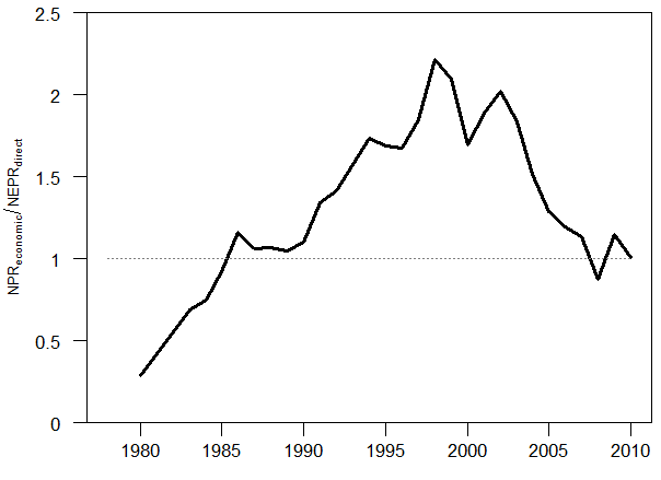
Figure 1. This is a ratio of how much the worldwide economy leverages money spent by the energy sector relative to how much surplus energy is produced by the energy sector itself. Specifically this calculation (using world numbers) = (GDP/money spending on energy by the energy system) / [ (world primary energy production – energy spending by the energy system) / energy spending by the energy system)].
I created Figure 1 by dividing the data from Figure 3 by the data from Figure 2. Figure 2 is a calculation of the leverage of energy, and Figure 3 is a calculation of the leverage of money. I now describe each of Figure 2 and 3.
For a full description of the underlying data and calculations, see Part 2 (and Part 1) of my papers in Energies in 2015.
Net Energy
Net energy provides an additional lens, besides money, to understand how our economy works. Net energy is the amount of energy that is left over for consumption after we subtract the energy inputs that are required to produce that energy. The energy production and consumption quantities you see in statistical databases (such as those housed by the Energy Information Administration (EIA), BP, and International Energy Agency (IEA)) is gross energy, often referred to as total primary energy supply (TPES) consumed per year. For example, the world TPES is approximately 550 EJ as reported by the EIA.
Figure 2 shows the data used in the denominator of the calculation of Figure 1. The solid red line indicates the average value for the world. The underlying data come from the IEA. This figure indicates that since around 1995, for every unit of energy consumed by the energy industry, the energy industry provides about 14-15 units of energy for all consumers and other industries. Before 1985, this “energy return on energy invested” was greater than 20 (data are not available to for a viable estimate before 1980). In the case of this figure, there are no other types of inputs considered besides energy itself. No wages. No materials. No computers or consultants. Nothing but energy.
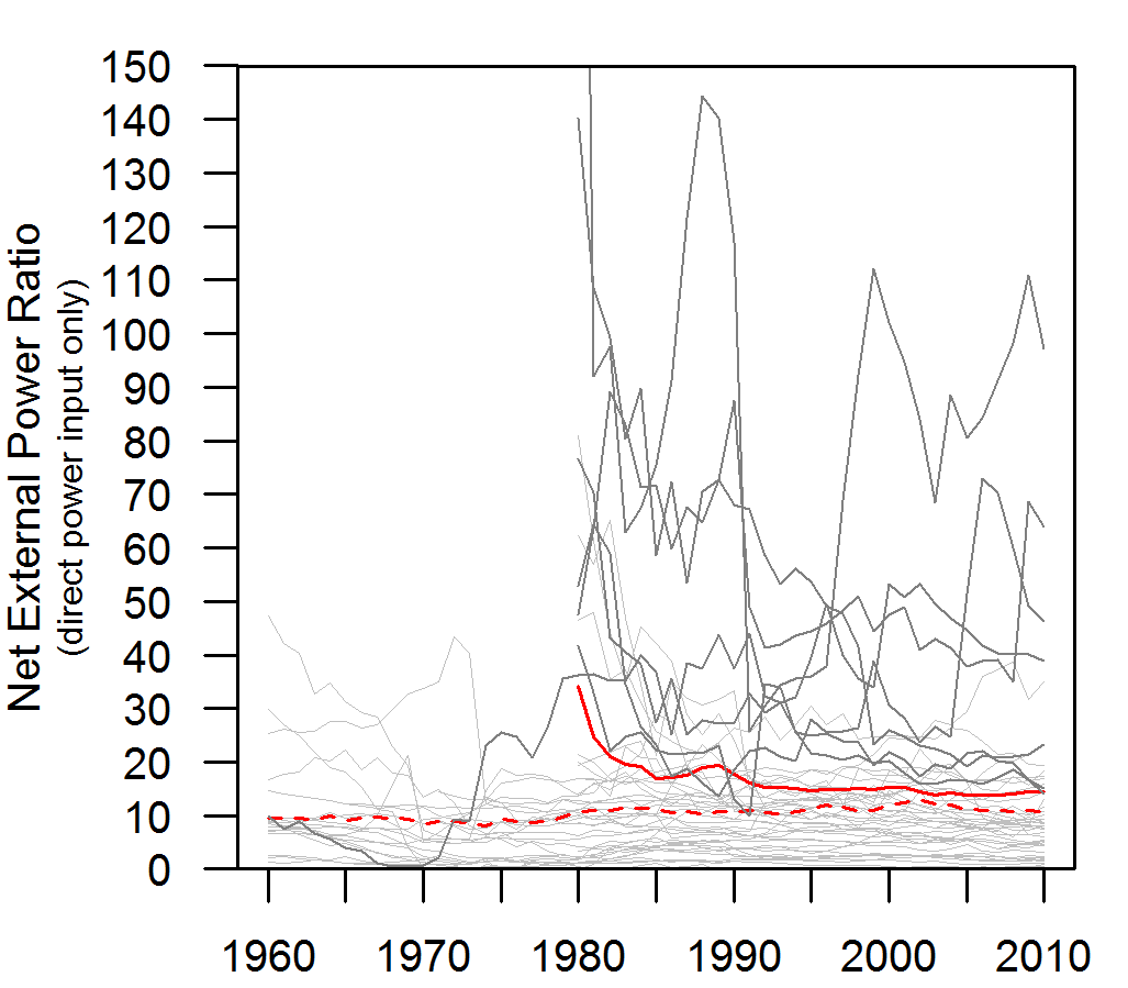
Figure 2. This is a ratio of how much net energy the worldwide energy system produces for all other sectors and consumers after it consumes the energy it needs for its own operation. The solid red line represents the world average. The dashed red line represents the average for OECD countries only. Each gray line represents the data for one country (the countries with high values are countries that are net energy exporters). Specifically this calculation (using world numbers) = [ (world primary energy production – energy spending by the energy system) / energy spending by the energy system)].
Money Leverage
Figure 3 is about money, not energy. Consider adding up all energy spending (in money) by the worldwide energy industry and dividing that by the GDP of the world. A typical quantity is 0.04-0.07, or 4-7%. Essentially this is an input (spending by energy sector) divided by an output (GDP). In order to compare these monetary data to the net energy data of Figure 2, I need to phrase them in an equivalent manner. Figure 2 shows energy outputs divided by energy inputs. Thus, by inverting the monetary energy spending ratio, I turn it from a ratio of input/output to a ratio of output/input. Thus, if world energy sector spending was equivalent to 5% (or 0.05), 1 divided by this number is 20. Thus, we can say that the economic output of the economy is 20 times larger than the monetary spending of the energy sectors. Figure 3 plots this ratio for the world.
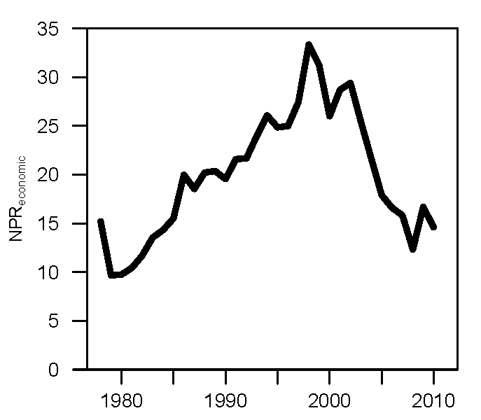
Figure 3. This is a ratio of how much the worldwide economy leverages money spent by the energy sector. Specifically this calculation (using world numbers) = (world GDP / money spending on energy by the energy system).
Why this is interesting
Fundamentally the ratios of Figures 2 and 3 are about measuring inputs of “something” to the energy industry in comparison to outputs of that “something” consumed or created by the rest of the economy. In Figure 2 the “something” is energy, and in Figure 3 that “something” is money. Figure 1 shows the data of Figure 3 divided by the data of Figure 2.
Should the output:input (“leverage” or “return on investment, ROI”) of energy (often termed EROI) be greater than or less than the output:input (“leverage” or “return on investment”) of money? My hypothesis is that the energy ratio should be larger than the monetary ratio. Thus, the measure in Figure 1 should less than 1.
The reasoning is as follows. The energy inputs used in Figure 2 only include energy consumed by the energy industry. As I wrote before, no other inputs such as wages, materials, offices, or administration are considered. By considering any number of these other inputs (and converting to units of energy), the energy return on investment ratio can only decrease. However, the assumption behind the monetary ratio of Figure 3 is that all types of inputs have been included in units of money. That is to say, the energy sector purchases inputs as energy, machines, and various services from itself and other economic sectors. Thus, there are many more inputs (theoretically all required monetary investments) considered in the monetary output:input ratio for the energy sector and economy.
So back to my hypothesis that the ratio plotted in Figure 1 should be less than 1. How can we explain values > 1? The general (but not satisfying) answer is that GDP (gross domestic product) is a measure of economic throughput that is not backed by anything purely physical, but by what we (as consumers) perceive as valuable. Thus, we can value a service or product at one level in one year, but change our mind as to the value in another year. Much value is also currently placed in information-related companies (Facebook, IBM’s Watson, etc.), and there is ongoing debate as to whether the value of this information (e.g., in social network companies) is overvalued. Is social networking overvalued, as a business, and will these valuations decline if people can’t actually afford to buy new products suggested by the ads targeting them? I suppose we don’t know the answer, and we’ll eventually find out.
Debt as an Explanation
But I think debt accumulation is likely the best explanation for why the economy seems to be able to leverage money more than energy spending by the energy sector. To some degree, increases in debt in the 10-20 years leading up to 2008 (when the ratio in Figure 1 reached a value of 1) were responsible for increasing the quantity GDP. Government and consumer spending beyond their means shows up as increases in GDP.
Also, if we consider increased debt a expectation of increased future consumption, and consumption (and production) require energy, then increases in debt are an expectation for increases in energy consumption. And don’t get confused here with discussions of “decoupling” energy from economic activity. There is yet no evidence that worldwide economic growth occurs without increasing total worldwide energy consumption. Possible evidence for this debt explanation is the fact that debt accumulation stopped in 2007/2007 (with the financial crisis and peak in commodity prices) when the ratio in Figure 1 was no longer greater than 1. If I were to have the data through 2015, my guess is that the number would have stayed near 1 through 2013/2014 before again increasing in 2014/2015 as oil prices were falling dramatically (assuming the energy return ratio of Figure 2 remained relatively steady).
I also anticipate (could be confirmed by further research) that the ratio of Figure 1 would be < 1 for all years before 1980 leading to the beginning of the Industrial Revolution. Largely speaking, we extract the easiest to reach resources first, and these resources have high net energy (= low cost). Thus, resources with higher net energy translate to larger values for Figure 2 which is the denominator for Figure 1. Thus, smaller values of Figure 1. Further, I know from my previous research that spending on energy was never lower than around the year 2000 (see my papers here and here for detailed explanations), which is what is indicated in Figure 3 (e.g., the higher the value the cheaper was energy). Energy continually became less expensive since the beginning of the Industrial Revolution until the 1970s and then again (much slower) through the end of the 20th Century. Thus, the values for Figure 3 (the numerator of the calculation in Figure 1) will always be larger for the previous 100+ years.
This concept of Figure 1 is so interesting because it is likely that the time period of 1985-2007 is unique in all of history as the time period when the economy leveraged monetary spending by the energy system more than the leverage in energy that was provided by the energy system. This is a ripe area for further understanding of macroeconomic modeling that properly accounts for the role of energy.