Several authors have concerned themselves with the possible causal relationship between the energy return on energy invested (EROI) of one or all of the economy’s energy supplies and the state of the economy, or perhaps the stability, structure, or sustainability and well being of “society” more generally. In this blog I point out some (but I don’t claim to be exhaustive) existing studies that attempt to link EROI and some aspect of “the economy” or “society”, and then show that due to its overall structure, my Human And Resources with MONEY (HARMONEY) model has an appropriate and sufficient overall structure (I’m claiming) to holistically provide insights as to how both resource depletion and economic decisions affect EROI and options for economic equality and structure more generally. In short, one needs to coherently link both a biophysical description of natural (energy) resource extraction and use and a full monetary (stock and flow) description of the economy including a behavior for investment, or effective demand (could include a household behavior assumption).
Hall, Balogh, and Murphy (2009) discussed this, mostly in the context of oil converted into refined fuels. Using some basic reasoning, but no formal model, they posited that oil extracted at the well needs an EROI ratio of at least 3:1. Brandt (2021) considered a simple 4-sector economy (energy, materials, food, and labor) scaled for the U.S. economy, and posited an EROI of the energy sector of less than 5:1 might start to significantly reduce discretionary energy for other economic purposes, thus triggering a restructuring of the economy, but without insight into household consumption or wages. He considers the “free fraction” of energy (e.g., what fraction is “net energy”) as well as the free fraction of mass of food, mass of materials, and hours of labor that might also similarly constraint the economy. Lambert et al. (2014) discuss how EROI and energy per capita values seem to relate to quality of life indicators at the country level.
In general, these three studies, as well as a host of others, posit that a declining EROI (or net energy output of the energy system) could get so low that the economy reaches the “net energy cliff” such that a very small decrease in EROI causes an increasingly large decline in energy available for the non-energy part of the economy. This conclusion is largely due to the nonlinear (or one of the) mathematical formulation of EROI = net energy/energy invested. If defining “net energy” = “energy extracted from the environment – energy invested” = Eout – Einvested, then
EROI = (Eout – Einvested)/Einvested (1)
If we assume Eout is constant at Eout = 100, then an EROI = 20 means Einvested = 4.8 and there are 95.2 units of energy for the non-energy part of the economy to use. A decline in EROI of an increment of 1, to EROI = 19 means that Einvested = 5 and there are 95 units of net energy left over – a decline of only 0.2 units of net energy from EROI of 20 to 19 — not much difference. Compare this to the scenario in which the EROI now changes from EROI = 5 to EROI = 4. In this case, Einvested changes from 16.7 to 20, and the net energy available declines from 83.3 to 80 for a seemingly similar decline in EROI of 1 (e.g., EROI from 5 to 4 instead of EROI from 20 to 19). Regardless of this nonlinear change, how might this actually play out in an economy in terms of the major indicators of interest such as wages (and wage equality), gross domestic product (GDP), employment, and population?
To answer this type of question, we need macroeconomic models that have the proper framework. HARMONEY has such a framework and I’ll highlight some modeling structures that are very similar to HARMONEY. Two of these are the Jacques et al. (2023) TEMPLE model (“Tilting Economic Momentum for Progress to Low-carbon Energies”) and the Dafermos et al. (2017) DEFINE model (“Dynamic Ecosystem-FINance-Economy”).
TEMPLE, DEFINE, and HARMONEY, use stock-flow consistent modeling (SFC) frameworks. Jacques et al. (2023) have a nice summary table of other so-called SFC models with similar structures. TEMPLE and HARMONEY run in continuous time (e.g., use ordinary differential equations) and DEFINE runs in discrete time (e.g., difference equations). In terms of defining the EROI of energy resources, the TEMPLE model characterizes both renewable and nonrenewable resources, but they are exogenously specified to a large degree. That is to say, Jacques et al. (2023) assume certain energy intensity (energy inputs per dollar of spending) for renewable and nonrenewable energy that is “exogenous” to other parameters in the model. In other words, as the model runs, no other states in the model affect how EROI changes as a function of how much renewable or (cumulative) nonrenewable energy extraction occurs. This is a critical difference from HARMONEY in which I don’t exogenously assume any energy intensity relationship. That is to say, HARMONEY does not a-priori assume a relationship between the monetary output of the economy (or an industry) and energy consumption. While I see this as a theoretical advantage of HARMONEY, it causes some more work to calibrate such a model to the real world because the tradeoff is that you must assume (other) additional physical characteristics of natural resources.
The Dafermos et al. (2017) DEFINE model and HARMONEY are similar in that they both (as stated in their paper) combine “… the stock-flow consistent (SFC) approach of Godley and Lavoie (2007) with the flow-fund model of Georgescu-Roegen (1971, ch. 9; …”. They also both conceptually describe the extraction and use of resources for both their material (or matter) and energy properties. While Dafermos et al. (2017) have a better integration of both non-renewable and renewable energy than in my King (2020) HARMONEY paper (and my King (2022) HARMONEY paper does not model nonrenewable resources), I find their assumptions for the material intensity to perhaps not be realistic enough. They assume the material and energy intensities of “green” capital (renewable resources) exogenously improve over time, but those of “conventional” capital (nonrenewable resource) remain constant. In principle (in my view) one cannot make this distinction because we should expect all energy technologies to be subject to some similar cost pressures driven by common inputs, including resource depletion and costs on various minerals (e.g., even common materials such as steel that is used both for drilling wells for hydrocarbons and constructing wind turbines and electric grid infrastructure).
Nonetheless “Essentially, all models are wrong, but some are useful.” (Box and Norman [p. 424]), and I definitely place both the TEMPLE and DEFINE models in the “useful” category!
One aspect that I’ve perhaps pursued more than others’ studies is some fundamental exploration of how EROI (the metric) relates to metrics of the “structure of society or the economy”. I’ve already summarized five core insights from my King (2022) HARMONEY paper, and here I’m going to discuss one of those insights in more detail: the relationship between wages, resource consumption, and EROI. I’ll also highlight a household consumption of “goods”, which I’ll use a proxy for general consumption and “well being” as much as you want to do so (i.e., I’m not saying physical consumption of stuff is the only important aspect of human well being).
Keep in mind that, within my discussion of each of the following figures and simulation results, nothing changes (unless specifically stated) regarding the characterization of the natural (energy) resource or its assumed relationships to forming capital and keeping the population alive. To make a new unit of capital, it must be made of resources. To operate capital, it must consume resources as fuel, and the population needs to consume the resource to stay alive.
In all figures the black solid line is the baseline scenario. It assumes wages always increase with inflation and capital (or machines) always consume the same amount of fuel to operate; in other words the capital always has the same energy efficiency. The economy grows from a steady state after assuming that there is an improvement in the technology to extract resources.
The plots in Figure 1 show that the amount of capital, population, and net output (or gross domestic product) increase to a higher steady state level. These increases are associated with higher resource (e.g., energy) extraction rates and wages decline slightly during the growth phase before increasing back up to previous levels when growth slows.
Now consider what happens to the EROI ratio, or in the terminology I use, the Net External Power Ratio (NEPR). NEPR is equal to “net power out / net power invested,” which is to say based on instantaneous flows of energy (i.e., power = energy/time). More specifically to the terminology in the paper there is a natural resource that is used to make capital and can be used as fuel such that NEPR is “net resource output flow from the resource (energy) industry” divided by “resources consumed by the resource (energy) industry” where:
- “net resource flow from the resource (energy) industry” = (resource extraction rate – resource consumption to extract resources – resource consumption for investment into capital that extracts resources)
- “resources consumed by the resource (energy) industry” = (resource consumption to extract resources + resource consumption for investment into capital that extracts resources)
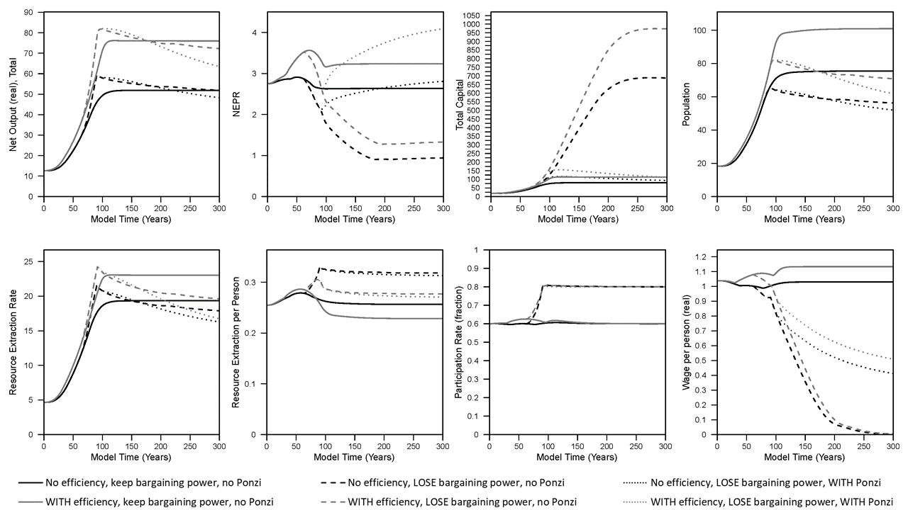
Figure 1. Results from simulations used in King (2022) (“full cost” pricing).
In the baseline (black solid line) scenario, NEPR (a.k.a. “dynamic EROI”) slightly rises and declines eventually settling at a value slightly lower than the start of the simulation. If we assume that companies invest in more fuel-efficient machines (capital) up to a pre-defined limit, then this is the scenario represented by the gray solid line. In this case of higher fuel efficiency, most indicators increase to higher levels: net output (GDP), capital, population, resource extraction rate, real wages, and NEPR. While the per capita resource extraction rate of the economy (akin to primary energy supply) decreases slightly in the steady state, there is higher per capita household (HH) goods consumption (see Figure 2). Consider this household goods consumption as the closest available metric to discretionary consumption (although the way the model works, there are no modeled decisions or behaviors by households).
Note that the steady state per capita HH natural resource consumption is the same in every scenario because that is what governs the death rate in the model. In other words, if there is a non-zero stable population, by definition the simulation ends up at the same level of per capita HH natural resource consumption (about 0.053 units of resources per person in the model) that enables the death rate to equal the birth rate.
To summarize the effect of increasing fuel efficiency of machines, it enables higher stocks (population, capital), higher levels of total extraction and consumption in the overall economy, higher goods (or discretionary) consumption, higher wages, and higher NEPR (or steady state “dynamic EROI”). And for this effect, I didn’t assume any changes to the characterization of the natural resource itself. I only considered changes in the fuel efficiency of both types of machines in the model: those that extract resources and those that make more machines (or goods).
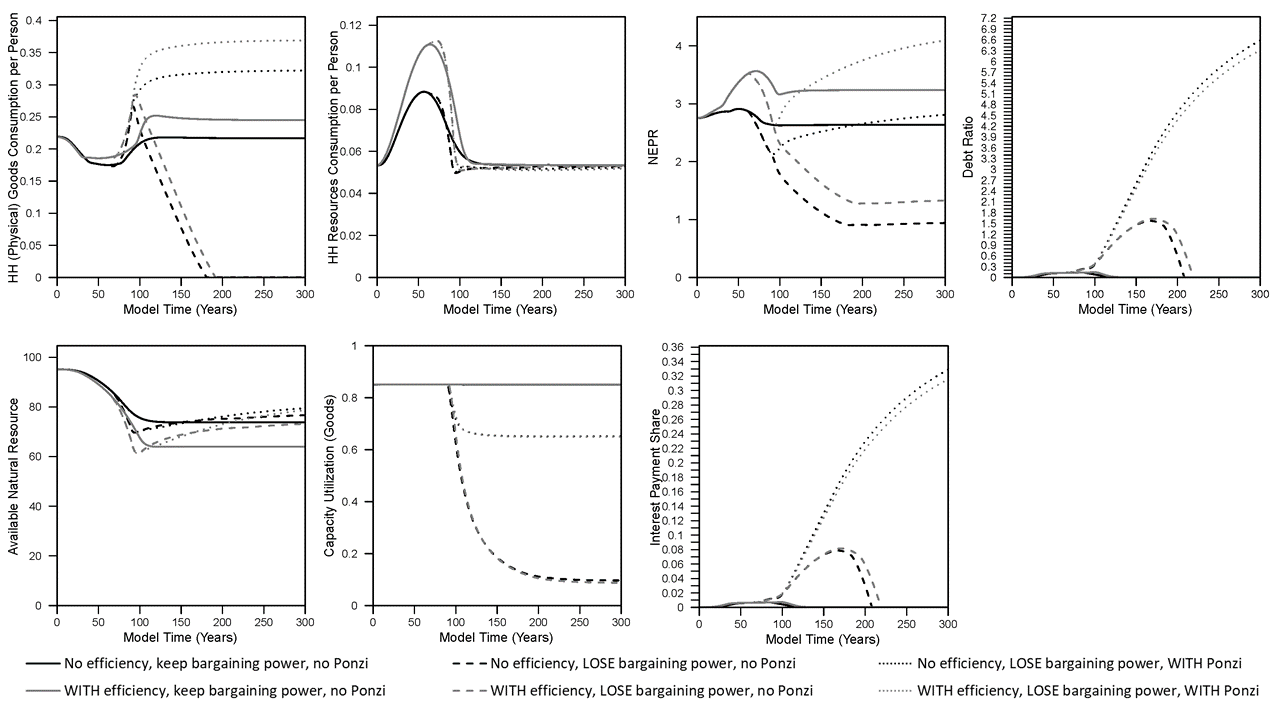
Figure 2. Results from simulations used in King (2022) (“full cost” pricing).
Further, recall that in obtaining these insights from running the model, I do not assume any fixed trajectory (in time, or relative to extraction rates) for resource intensity (extraction rate / GDP) or NEPR itself. I don’t actually know the metrics of NEPR or resource intensity until I simulate the model. Instead, the model specifies the underlying parameters and variables that are needed to calculate resource intensity and NEPR. One can calculate a steady state NEPR that requires one to simultaneously solve for steady state levels of population, the remaining size of the natural resource (since it determines the extraction rate), and the labor, capital, and capacity utilization for both sectors (goods and extraction sectors).
While increasing the engineering (resource) efficiency of capital is a technological characteristic, let’s consider changing a behavioral characteristic in the model: how we assume businesses pay wages.
In the results so far, wages increase with inflation. This is akin to many union contracts in the United States in the 1950s through mid-to-late 1970s. But what if businesses do not have to increase worker wages with inflation? At the simulation time, T = 60, about the time of the peak in per capita household resource consumption, I decrease the “bargaining power” of workers from 100% to 0% by time T=160, and this simulation is represented by the dashed lines (black dashed lines have no efficiency and loss of bargaining power; gray dashed lines have efficiency and loss of bargaining power). The simulation results are now dramatically different.
- Net output and the total resource extraction rate increase to a higher peak than before, but later decline to rates near or below when full bargaining power existed.
- Total capital accumulation increases dramatically, by almost 10 times the levels of before.
- Population declines to less than 80% of the levels with full bargaining power.
- Per capita resource extraction (not consumption by households) increases to a higher level.
- Wages decline to zero.
- Participation rate (total employment as a fraction of population) increases to the maximum value of 80% instead of the previous steady state (“equilibrium”) value of 60%. (With wages so low, why not employ as many people as possible!)
- NEPR declines to much lower levels.
- The remaining amount of “available natural resource” increases (relative to full bargaining power).
In the context of relating net energy to some metric of economic well-being, NEPR declines dramatically while real wages per capita (and total) household goods consumption declines (eventually) to zero. The reason why real wages and goods consumption decline to zero is that, as long as wages can still decline, businesses can continue to make a profit and invest in more capital. Figure 2 show the capacity utilization of the capital (in the goods sector, but also similar in the extraction sector) also dramatically declines. That is to say, business keep investing in capital that they can’t fully utilize because there is not enough resource extraction to act as fuel to operate the increasingly large number of machines.
Again, note that I have not previously specified what should be the NEPR (or dynamic EROI) over time for the resource (or energy) sector, and it is not intuitive to anticipate what would be the trajectory of NEPR over time even though it is (mathematically) possible to calculate an equilibrium “minimum NEPR” of this simulated world (i.e., assume no wages and solve for equilibrium power outputs and inputs).
Also, the model used for these results assumes that the more the natural resource is depleted, the more resource consumption is required to extract the marginal amount of resource (assuming all other things being equal). So in this case of a loss of wage bargaining power, because the natural resource is larger, then we might expect the equilibrium NEPR to be higher because the resource is less depleted. Therefore, it is the maintenance of a larger amount of capital, and thus the embodied resources (or energy) input into maintaining that larger quantity of capital that drives NEPR well below the levels with full bargaining power.
It is easy to imagine that this simulated world without wage bargaining power would not be a good one in which workers would live. By the time of the end of the simulation, wages are practically zero, and there is no goods consumption by households. In effect this is a slave economy. The workers are still operating the machines in the economy because the model assumes a certain number of workers are required to operate the machines, and 80% of the population is working (at the assumed maximum employment rate). It seems reasonable to say if you cannot bargain for wages at all, you could be driven to a wage of zero. Thus, in this situation of a loss of bargaining power, the NEPR of the energy system ends up declining to very low levels because of how business investment in the resource sector is able to respond. It is not that we specified the NEPR (or net energy) of the economy to decline, and then wages declined.
To drive home perhaps the most important point of this blog:
economic decisions about how to distribute monetary revenues have as much influence over NEPR, or EROI, results as the characteristics of the natural resource and extraction technology themselves.
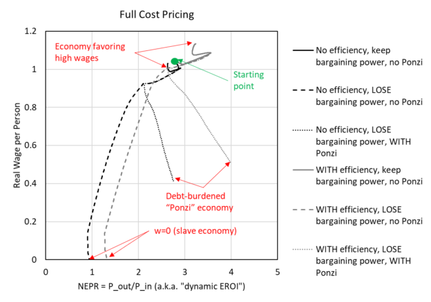
To imagine this idea further, I’ve made Figure 3 (which is perhaps more confusing) to plot real wages versus NEPR (the net external power ratio). Each simulation starts at wages near 1.02 and NEPR near 2.8.
- The simulation with full wage bargaining power and no efficiency stays near the starting value (going in a small clockwise pattern, black solid line)
- The simulation with full wage bargaining power but with the increase in capital fuel efficiency increases up and to the right (higher wages and higher NEPR, gray solid line)
- The simulations that lose bargaining power decline down and to the left until wages are at zero (e.g., a slave economy, dashed lines).
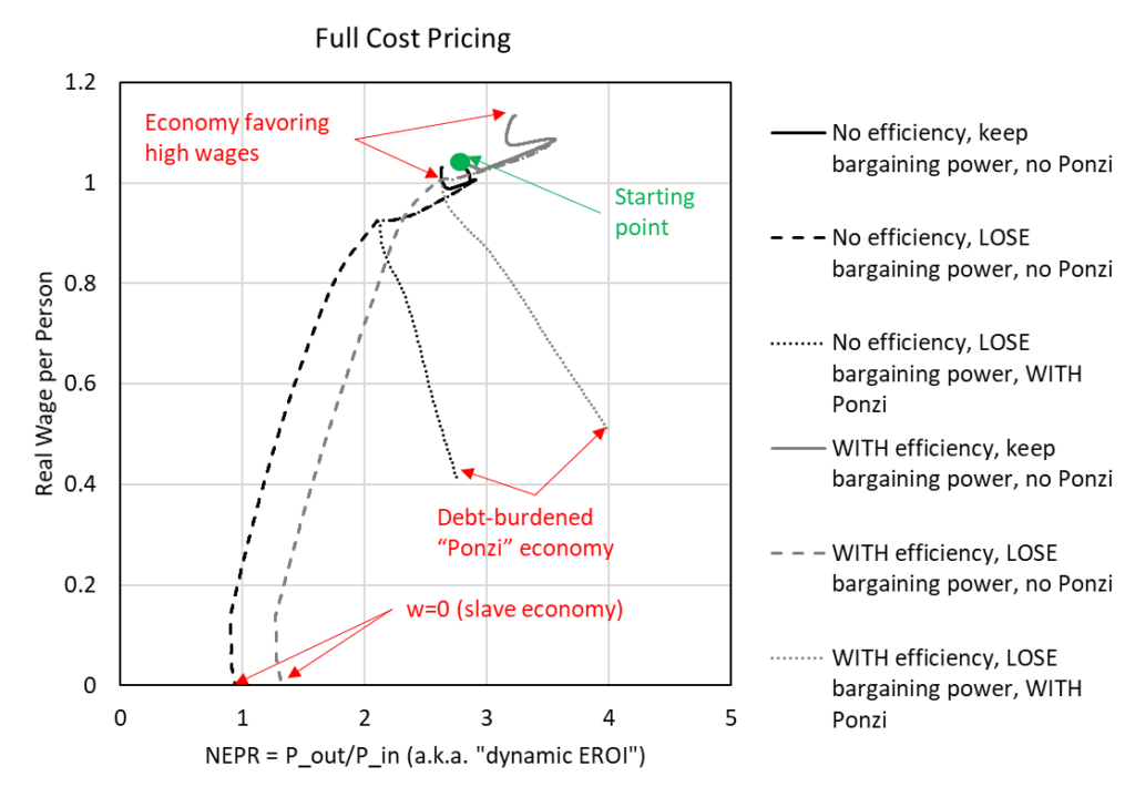
Figure 3. Plot of real wages versus net external power ratio (NEPR) using results from simulations used in King (2022) (“full cost” pricing).
The third category of simulation results in shown in the figures is the effect of what I called Ponzi investing. The Ponzi investing also occurs simultaneously with the loss of worker bargaining power for wages. While my definition of Ponzi investing in my paper likely doesn’t fit with the most true definition of a Ponzi scheme, it might have been better characterized as “speculative” investment. Regardless, in my paper companies begin Ponzi investment when capacity utilization of capital decreases some amount below a “targeted” level (say 85% in the model). That is to say, if the companies have $100 to invest, and capacity utilization is low (meaning there is “too much” capital since it is not being operated at the targeted level), then companies start to invest some of the $100 into pure debt rather than investing all of the $100 into new physical capital (or machines).
The effect of Ponzi investing (see in the figures) is to decrease the total accumulation of stocks (capital, population) and the resource extraction rate. While real wages decline as in the case of no Ponzi investing, the wages don’t decline as much. Perhaps unintuitively, the smaller population has higher per capita goods consumption, and while the model does not specify the distribution of consumption, we might interpret an “elite” banker population taking a high share of that consumption while the workers with lower wages consume a small share.
Finally, because the Ponzi investing diverts some profits, and thus natural resources, away from investing in physical capital (more machines), the NEPR of the energy system actually ends up increasing to levels higher than in the ‘baseline” case (with and without fuel efficiency) with full bargaining power and no Ponzi investing. The catch here is that debt ratios rise considerably in Ponzi investing, as opposed to eventually declining to zero in this model, and this causes interest payments (from companies to the bank) to take a non-zero fraction of economic net output. These interest payments put downward pressure on company profits and wages, and again, we might assume flow to a class of bankers.
Results with Marginal Cost Pricing
Now I repeat the same results above but with one twist: how the model solves for prices. In the model there are four main costs: intermediate consumption (how much goods and resources must be purchased as operating costs), wages, depreciation, and interest payments on debt. If all of these costs are passed into prices, then this is “full cost” pricing (as stated in the previous figure captions). Many economic models do not assume full cost pricing, but instead they assume marginal cost pricing in which the costs of interest payments and/or depreciation are not passed (or included) in prices.
An example of a business model that includes full cost pricing is a fully-regulated and monopoly electric utility that owns the power plants and electric grid that serves its captive customers. In this case, a public utility commission approves (or disapproves) the utility’s investment and operating costs, as well as how much it can borrow (setting interest payments). All of these costs then dictate the price of electricity approved by the public utility commission.
Marginal cost pricing is perhaps more pervasive in the economy, and might be representative of companies selling commodities (e.g., energy, food) and various consumer and investment goods (e.g., furniture, cars) in which firms must compete to sell their items against many similar items from competitors. In this case, Firm A might want to pass on its costs of interest payments and depreciation to customers, but Firm B with lower interest payments might be able to sell at a lower price. Thus, Firm A will be pressured to sell closer to their marginal cost of production.
The Figures 4-5 below show the same plots as Figures 1-2 above, but instead by assuming marginal cost pricing. I highlight some of the important differences, and in my paper I hint that the marginal cost pricing result shows more similar structural patterns of change to the U.S. economy. When assuming marginal cost pricing:
- While wages are lower with the complete loss of wage bargaining power, wages are not force to zero as in the case of full cost pricing.
- Capital accumulates to approximately 2X the level when assuming workers lose wage bargaining power, but this is much lower increase than the 10X increase when assuming full cost pricing.
- The dynamic patterns are very similar (whether losing bargaining power or with Ponzi investment) for population, net output (GDP), the available natural resource, and resource extraction rate.
- Per capita household goods consumption increases when workers lose bargaining power and slightly more when additionally assuming Ponzi (or speculative) investment by firms.
- Debt (or the debt ratio) does not increase as much as with full cost pricing.
- And finally, … NEPR (net external power ratio, or “dynamic EROI”) patterns are very similar in all marginal cost simulations, with the lowest level reached when assuming workers lose bargaining power (but there is no Ponzi investing). This lowest NEPR occurs in the equivalent scenario as when assuming full cost pricing as both have the highest capital accumulation and lowest capacity utilization.
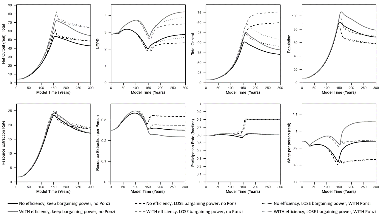
Figure 4. Results from simulations used in King (2022) (“marginal cost” pricing).
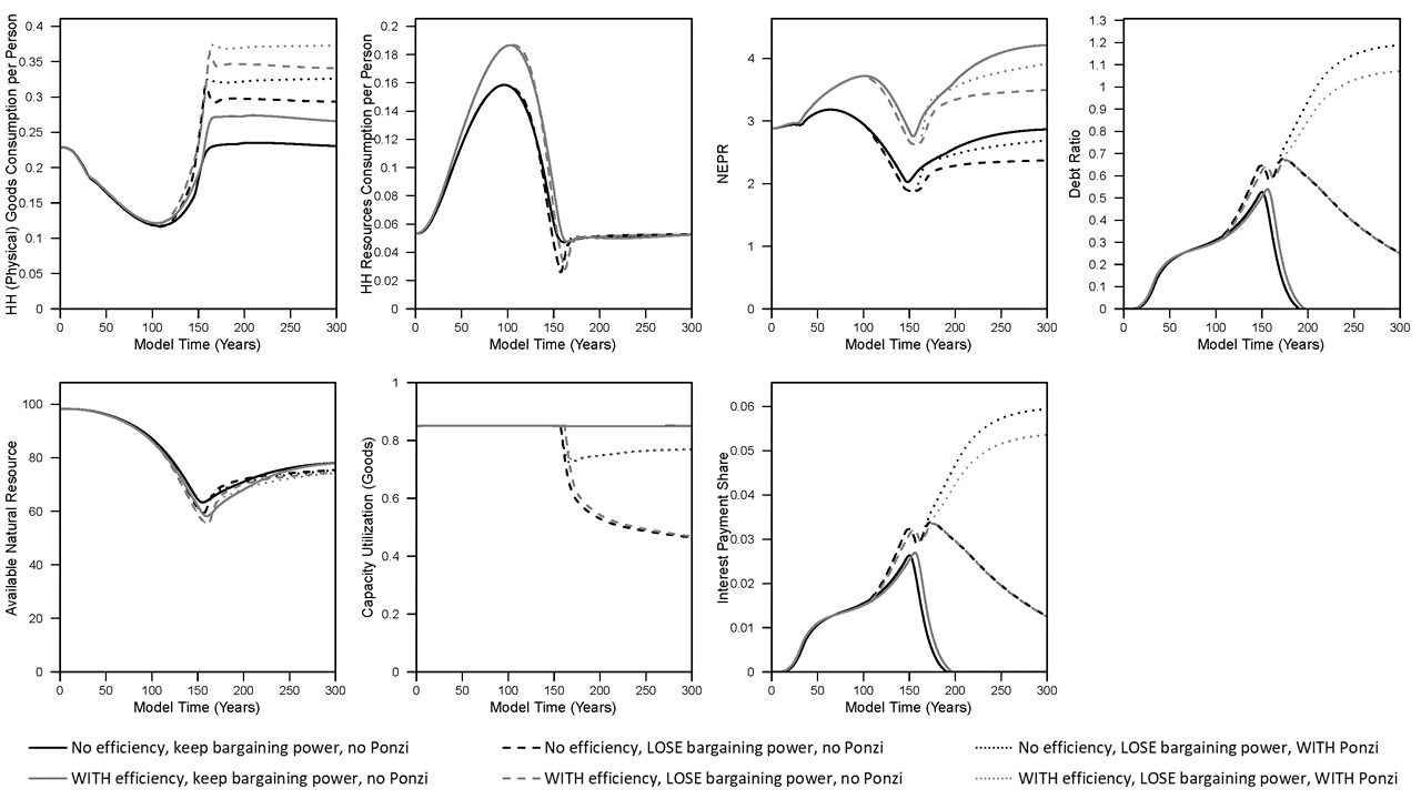
Figure 5. Results from simulations used in King (2022) (“marginal cost” pricing).
Summary
To summarize the main points of this discussion that considers how energy return on energy invested (or in my parlance, net external power ratio) relates to economic outcomes and the “structure of the economy”, consider:
- In my model and the real world, the NEPR (or “dynamic EROI”) calculation is an output calculated from the model and real world data. This metric is not an input assumption that can be fed into a model while remaining unaffected by the other variables within the model, and thus the same for understanding real world data and outcomes.
- There are at least two major economic assumptions about the structure of the economy that can greatly affect a calculation of NEPR (or “dynamic EROI”)
- how prices are formed: full costs versus marginal cost
- whether workers wages increase with inflation or not
There are many other highly important aspects of the economy that I did not explore within the paper I’ve summarized (e.g., different rules for how firms invest, there is no government sector, etc.), and thus the results at this point provide some insights rather than hard and fast rules. To know more you’ll have to read the paper, read other blogs summarizing results, and watch videos of me explaining how the model works:
- ink to paper: https://link.springer.com/article/10.1007/s41247-021-00093-8
- See video: http://careyking.com/video-the-economic-growth-modeling-we-need-inet-oxford-university-may-2022/
- Another blog: http://careyking.com/new-harmoney-insights-into-the-interdependence-of-growth-structure-size-and-resource-consumption-of-the-economy/